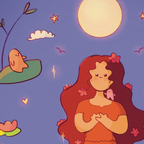
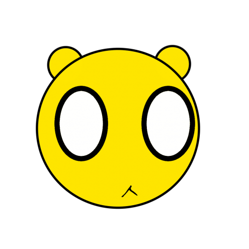
“Claire!” Elle woke up with her daughter’s name on her lips. Startled, she sat up and looked around the living room with her heart still beating loudly in her chest. A dream, she realized dazedly.
Slowly, she crossed the way to the back door. With unseeing eyes she gazed out into the garden.
She remembered waking up in the hospital six years ago and seeing her husband sitting next to her. She remembered how he took her hand into his and looked at her with eyes full of despair. He told her that the doctor thought Claire might not survive. That she might die before she was even born, die before she had a chance to look into her mum’s eyes, feel a kiss on her forehead, clench her little fist around her dad’s finger, hear them speaking to her without a belly barrier between them… It was a silent, terrible death. It was the death of someone so precious, so innocent, so tiny…
Elle took a shuddering breath.
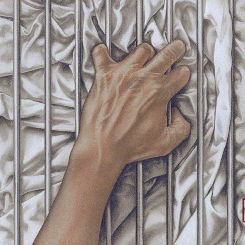
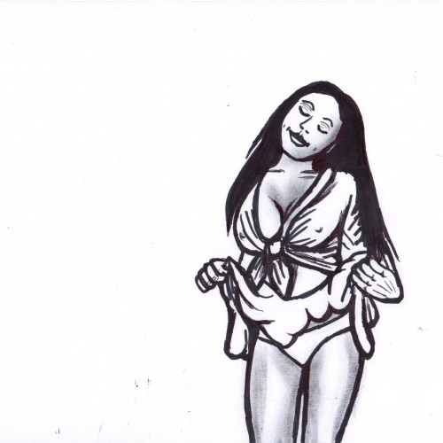
Some LGBTQ+ members of the community can’t openly love who they want to love, so the bars represent that barrier. The fabric, with all its complex folds and creases represents sensuality, desire and love. Love, in all its forms is a complex thing of beauty.-------------
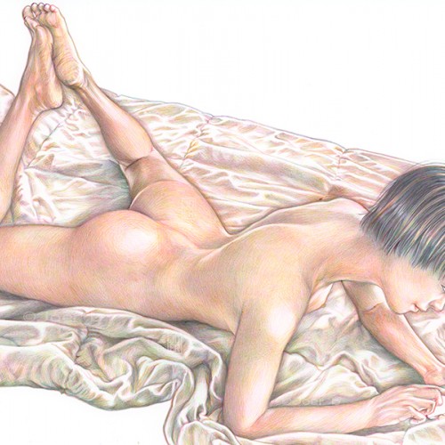
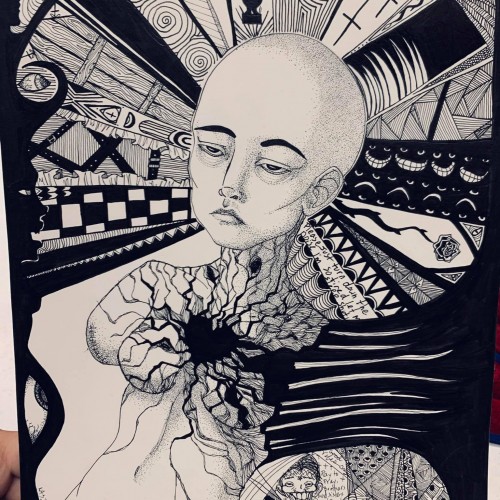
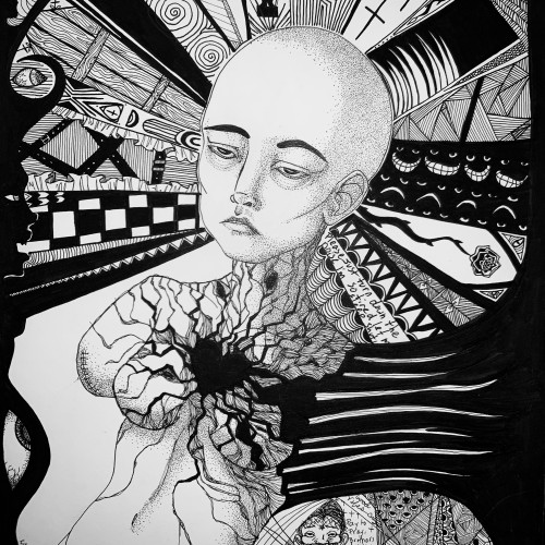
The companion piece to my previous post ‘Ecstasy.’ Agony and Ecstasy were always meant to be a diptych. The issue for me is that there is a two-year gap between the completion of the two - there is a noticeable difference in the the way both were drawn.
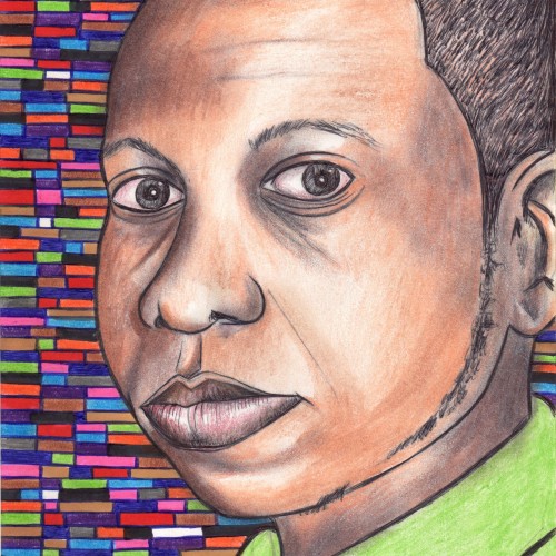
Faber Castell pastel pencils, Black and White Generals charcoal pencils on 9” x 12” Strathmore Toned Grey sketchbook paper.
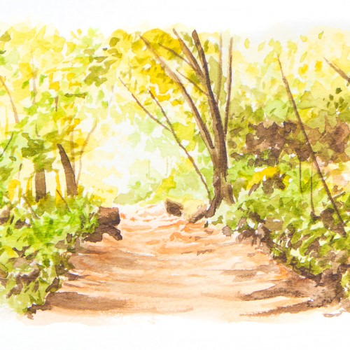
At the top of Pentregwenlais near Llandybie is Gwenlais Quarry. In itself, the quarry is quite beautiful with its sheer rock faces and the way that nature has started to reclaim it. This scene is one of the paths that leads down from the top of the quarry back towards Pentregwenlais. I was going to do it as a pen & wash but by the time I'd finished with the watercolour I thought it was too complex to start putting ink in there. Watercolours on watercolour paper (6x8")
This is a digital drawing of two magical lions. I'm pretty happy with the way they turned out. The magical wind behind the Sky lion (with the horn) is especially cuter than I thought it would be. That wasn't planned at all -- just a last minute decoration thing. Anyway, hope you like.
I got a pack of loose watercolour paper from eBay in 2018. The side this was painted on had a really strange pitted texture on it. I thought it might be interesting but I didn't like the way the paint gathered in the pits. I just use it for sketching and testing colours these days.
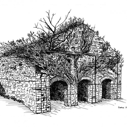
I stumbled across this dilapidated coach house that would have once been part of the Glynhir estate while exploring the public footpaths around Llandybie. I loved the way nature had reclaimed it.
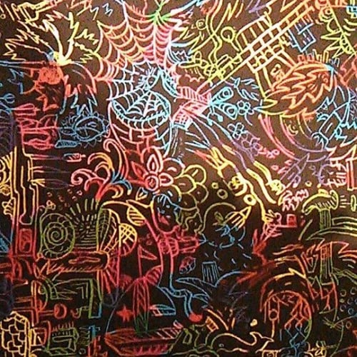
A little doodle I made in class. Zentangles aren't really my thing, but I've been doodling a lot with a pen, and I love the way it looks. It's supposed to be some sort of stick-monster.
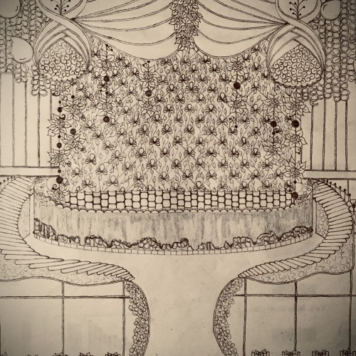
You are always welcome to come into my world. Adventure, explore. Here perhaps, is the way in. Out? You have to figure that one out on your own. I have never tried.
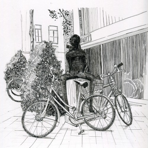
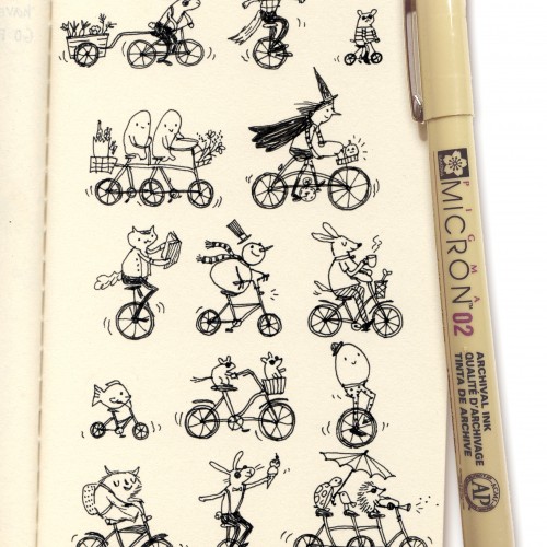
Some bicycles in front of a statue and a bicycle shop. Sittard, The Netherlands. I am not quite happy , the way the statue worked out. I should have used a smaller nib for that.
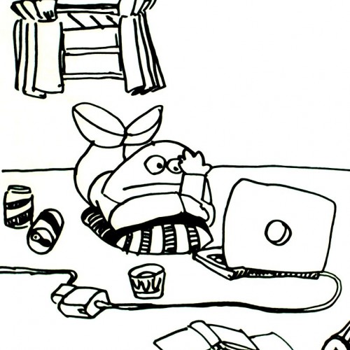
Nat checking her email. The polar fleece blanket colour and texture didn't turn out the way I wanted it to.
Bic4 Ballpoint Pen, Sanrio Novelty 10 Colour Ballpoint Pen on Archival 8.5" x 11" paper
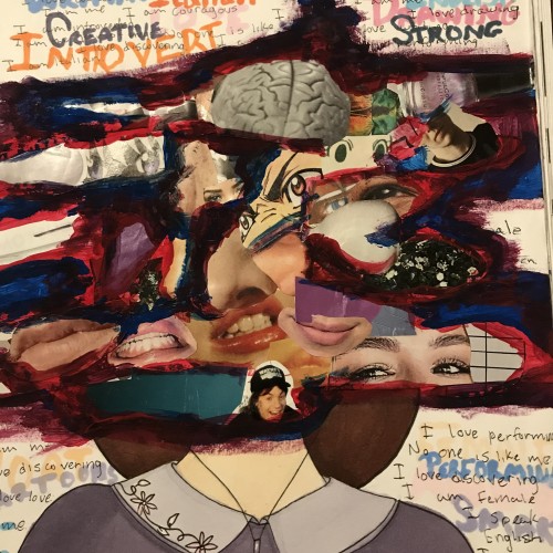
Since I’m new I decided I would update something that shows kinda who I am! :) I made this in 2019 for my art class where we had to make a collage with drawings and words to describe myself. I love the way it turned out so it is for the first page in my current sketchbook.
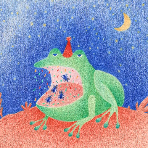
Frog, moon and stars! Another one inspired by @moonchildillustrations and her #moontoberweekends prompt, this one combines two of them.
Fortunately, I had to search for really cute pictures of frogs with their mouths open.
By the way, what kind of music do you think the flies are dancing to? : .
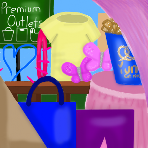
Ta-da! Finally done! This was inspired by my annual back to school shopping trip in August with my mom, my siblings, and my grandma. The sign is a bit of a clue to that, the heart is similar for he logo of one of my favorite stores (until they closed last month), and the tan thing in the corner reminds me of the dusty playground we stop at between stores. The hair clip, butterflies, and purple corner (it's really a hair extension) are all from my favorite accessory store. The railing is for the walkway between stores and I don't really have to explain the shirt, skirt, pants, and shopping bag. No trip is complete without a bucket of pretzels to eat on the way home! Anyway, I hope you like my art!
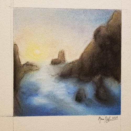
Pastels...I've never been a huge fan of working with them, mainly because I can never seem to get them to blend or move the way I want. I think this turned out okay; it's not the worst it could've been...not the best. It was fun to try, considering the fact that I rarely try new mediums, and it got my mind off everything I've been worrying about. Anyway, enjoy.
When I was a kid, I used to draw nonstop. As I got older, I got harder on myself. Now I only draw when I think I can make something big of whatever I'm doodling. I want to go back to the way I was before,
More ballpoint pen experiments. This was trying to "blend" colors, using ball point pens in a similar way to colored pencils. I found Layering evenly to be pretty difficult, esp with the pens blotching and very very limited burnishing. The interesting thing is that the paper doesn't seem to get "tired" the way it does with pencils. This is just cheap printer card stock.
This artwork is not really mine as I drew it from a tutorial, but I love the way the pink comes out in every way possible. I hope you too like this pinkish scenery ;)
Uhh I don't see that much FANART of asahi so I thought let's make one myself. He's my favourite character from haikyuu!! Well what do you think of it? Please let me know!!